
If, like me, you started your OutSystems journey prior to the mainstreaming of the Reactive Web and Mobile versions of OutSystems, you may have encountered the Balloon pattern, which was originally a part of the Silk UI framework, and continues to be available in OutSystems UI, but only if you are building Traditional Web applications.
The Balloon…A Superior Tooltip
The Balloon pattern is essentially an enhanced Tooltip with support for more content options than a Tooltip would typically allow. Where a Tooltip supports only a single content area, and is generally used for simple text-based content, the Balloon pattern provides more flexibility with a title, content, and footer area. Both patterns provide a selection of triggers (hover, click, or manual), and the ability to select the position of the element relative to the element that it is related to.
As noted above, though, the Balloon pattern is only available when using OutSystems UI in a Traditional Web application…so if you want the UI flexibility afforded by the Balloon, you’re out of luck…or are you?
Forge to the Rescue!
During a recent project, my team had a need for the kind of functionality the Balloon pattern provided, but we were working with the Reactive Web application type, so the Balloon pattern from OutSystems UI wasn’t an option. What to do? Check the Forge, of course!
If you’re not familiar with the Forge already, it’s OutSystems’ repository of UI patterns, connectors, extensions, sample applications, and more. With more than 5,000 shared assets, if you need to do something that isn’t directly supported by the platform, there’s a good chance it may already be available on the Forge. It’s important to note that the Forge is a mix of assets created by teams at OutSystems (many of which carry the “Supported” designation), as well as those created by the OutSystems community, which are not supported by OutSystems, but may be supported by the creator. Some community-provided assets carry a “Trusted” badge, which means they’ve gone through a review process to assess quality and more. Details can be found here.
Searching the Forge for “Balloon” returns 3 results:
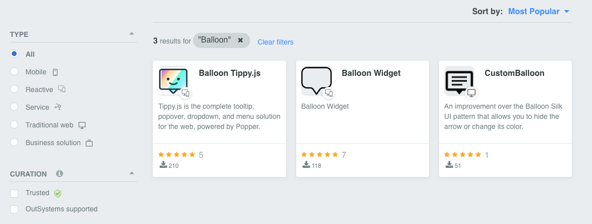
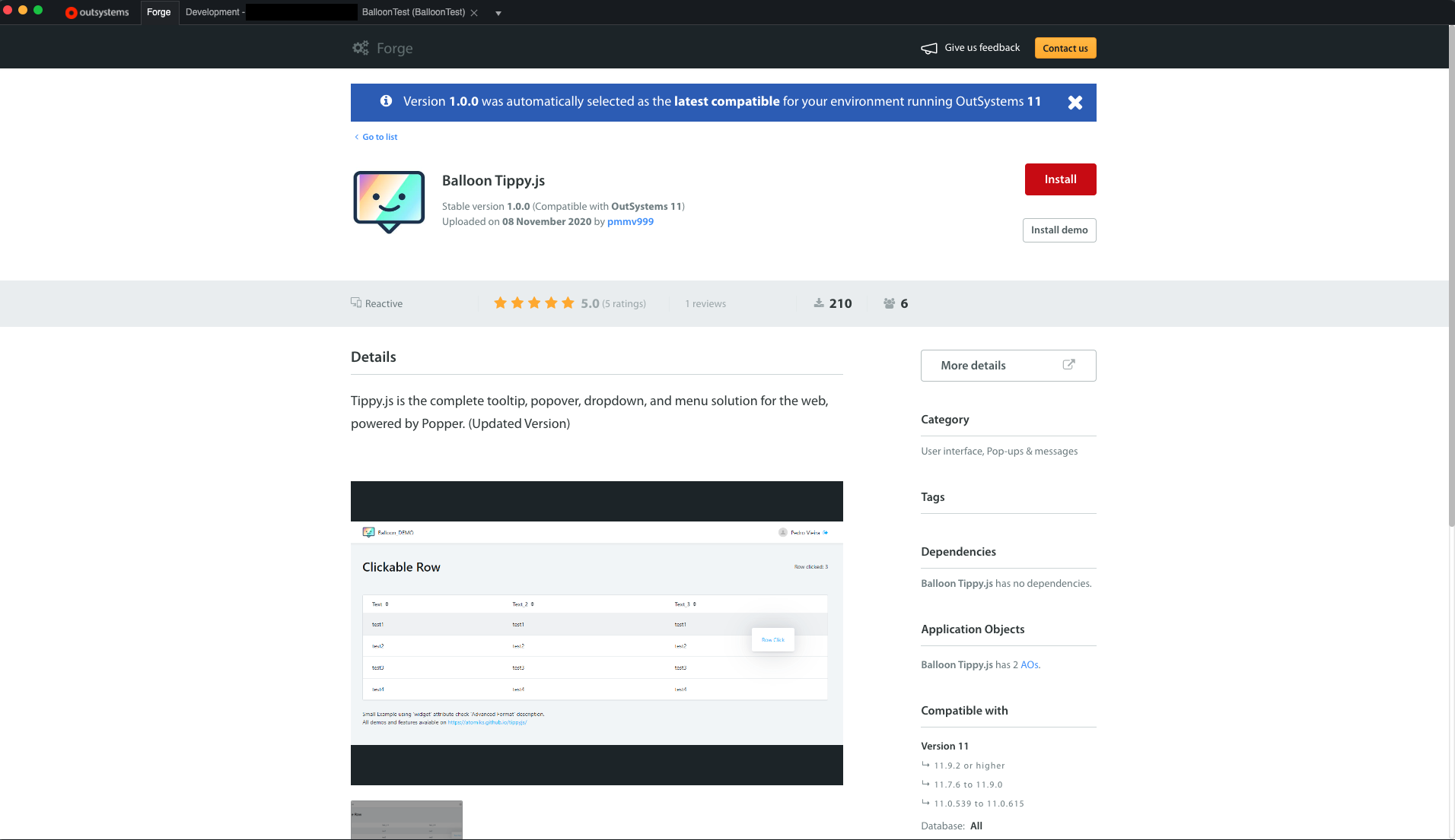
Of the 3 results, 1 is for Traditional Web, so that’s out. When looking for a component or widget on the Forge, I typically look at both the number of downloads and the number of reviews as an indicator of which components are more widely used. I’ll also sometimes check the Support tab in the component listing, and see whether the author has added documentation. Both of the components above for Reactive Web are pretty similar in those areas, so in this case, I reached out to some folks internally to see what they’ve used, and Balloon Tippy.js got the nod.
Using the Component
Once you’ve decided on a Forge component to use, you have two options. You can download the component from the Forge website, and add it to your project by opening the downloaded version from Service Studio or Service Center, or my preferred method, you can go to the Forge tab in Service Studio, locate the desired component, and install it from there.
Note that some components also include a demo, which can be helpful in understanding how to use the component. Once installed, the component is essentially just another OutSystems application, meaning you can open it up, inspect the UI, flows, JavaScript, etc. to better understand how it operates, tweak it to suit your needs, etc.
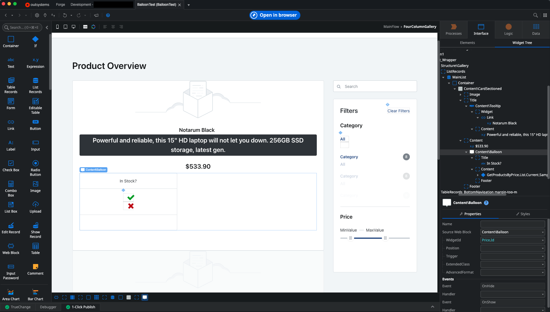
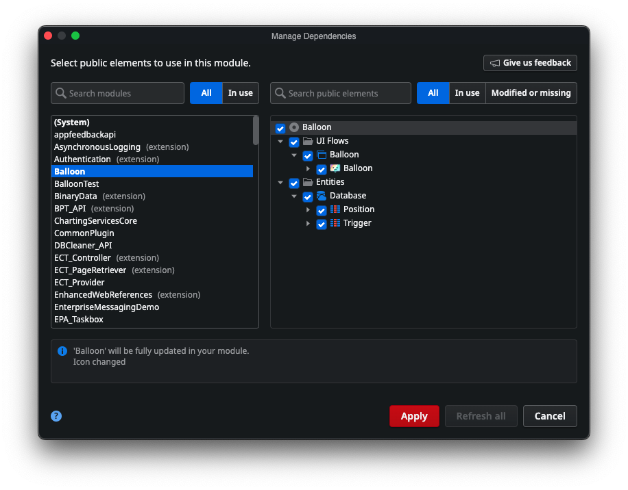
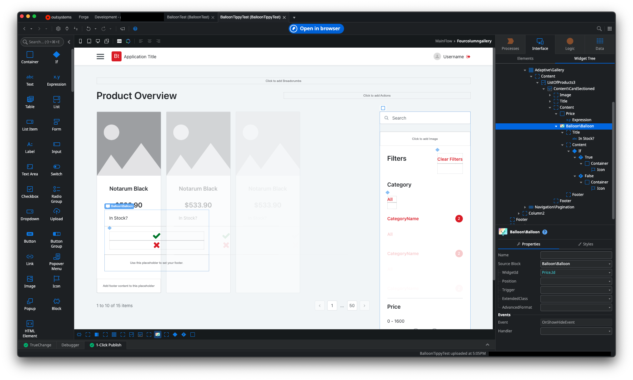
Once you’ve installed the component, you’ll need to add a reference to the desired UI blocks, flows, and entities, depending on the functionality exposed, and what you need for your use case. In my case, I’m just selecting everything Balloon Tippy.js has, since it’s a pretty simple component.
Once the dependency has been added, using the component is exactly the same as using the Balloon pattern from Traditional Web. Simply locate the Balloon widget in the toolbox, drag it to the desired location on the screen, add the desired Title, Content, and Footer, and set the WidgetId property to the Id of the widget you want to use to trigger the display of the balloon on hover or click.
Wrap-Up
The moral of the story here is two-fold. One, if you are finding the Tooltip pattern to be a little restrictive, and want more flexibility for your content, the Balloon pattern is there for you if you’re using Traditional Web (and I’m sure some of you still are). Two, if your favorite pattern has been deprecated, or if you’re looking for something that the OutSystems platform doesn’t natively support, it’s worthwhile to check out the Forge to see if OutSystems or the community have provided that functionality for download. Sometimes, as in the case of Balloon Tippy.js, the component may even be essentially a drop-in replacement that works exactly like the one its replacing, making it super-easy for you to implement in your applications.
Would love to hear your favorite components or patterns…feel free to drop them in the comments!