Or…I was a Teenage Design Have-not
I’m going to avoid casting aspersions on my fellow developers and instead simply own up to my own failings…I’ve been developing software since I was 10 years old (my first program was written in BASIC on a Commodore PET), and professionally for well over a decade, and for most of that time, I believed that design was someone else’s job, and that it didn’t matter whether I could design my way out of a paper bag.
WRONG!
Design is everyone’s responsibility, at least to some degree. No, you don’t have to start wearing black turtlenecks or engaging in other clichés, but what you should do is start cultivating a basic knowledge of design, and training your eye for what is and isn’t good design, both in the world of pixels as well as in the real world. Have you ever found yourself marveling at how difficult it is to figure out how to use some basic device? Listen to that voice in your head…it’s telling you that you’re dealing with a bad design.
An example of this may be found in some of the newer water coolers I’ve encountered. In a misguided attempt to modernize this humble staple of the office, some manufacturers have added text displays, extra buttons (including in some cases having more than one button of the same color). Think of a water cooler in your mind’s eye…you’ll probably see two spigots, one with a blue lever, and the other with a red lever, for cold and hot water respectively. There’s no need for an instruction manual, and it doesn’t matter whether your native language is English, Spanish, German, or whatever, the use of color easily conveys the purpose of each spigot. If you replace these easy-to-use spigots with buttons and screens that may convey more information, but require more time to comprehend, you have not done any favors for the person who simply wants a drink of cold water.
For developers who are fortunate enough to work on a team with a full-time dedicated design professional, then that person can lead the effort in creating and executing a beautiful and functional design. But we, as developers, aren’t off the hook. We have to execute on the vision and ensure that the app being developed looks great and works well.
And for those of us who sometimes (or always) have to work without the benefit of a designer on our team, it’s all the more important to think about and learn more about design, including observing and noting both good and bad design examples all around us, so that we are better able to provide user interfaces that are visually compelling and intuitive to use. This is true for all applications, but it’s especially true when building apps for the web, or for Windows Phone (or other mobile platforms), or for the Windows 8 Store, where your competitor is just a click away. And if your app is ugly or hard to use, that click will come quickly.
To put it bluntly, our success as developers is riding on adding design knowledge to our toolbox, and now is a great time to start building that toolset.
Microsoft Design
These are two words that, when placed together, may draw snickers in certain corners. And you could argue there was a time when that snickering had a basis in fact. Not anymore. Microsoft has spent years building its design muscles, and creating a consistent and compelling design language, called Metro.
I had the opportunity to present at the MoDevUX conference in Tyson’s Corner, VA. MoDevUX focused on user experience and design, and had attendees who design and develop apps for all manner of platforms. I gave a 30-minute talk on the Metro design language, and attendees seemed pretty impressed from the buzz on twitter afterwards, including one attendee who came away with a different opinion than he started with.
I’m grateful for the opportunity to share some perspective on how design is evolving at Microsoft, particularly since it gave me additional incentive to dig deeper into the Metro design language, and its inspirations in the world at large, as well as its roots in earlier Microsoft products.
Metro Inspirations
 There are several movements that have had an influence on the Metro design language, including the Bauhaus movement of art and architecture, Swiss Design, and Motion Design in Cinematography. Visually, Metro takes some of its cues from the world of wayfinding signage. As with some of the previously mentioned influences, this is a world that has a strong emphasis on typography and iconography that are stripped down to their essence, with no unnecessary ornamentation.
And there’s a good reason for this…when you’re rushing to catch the next subway train, or to try to make your flight before they close the doors, the last thing you need is visual noise getting in the way of the message…where is my gate? Likewise, Metro design places the focus where it rightly belongs, on the content that matters to your users, not on decoration or chrome.
You can learn more about the inspirations for Metro by watching Sam Moreau’s talk from BUILD, entitled “Designing Metro style: principles and personalities,” which does a great job of exploring the topic of where the Metro design language came from, among other things.
##
Metro Ancestry
One of the first major software releases to show an end-to-end Metro influenced design was Windows Phone 7, as I’ll discuss in a bit. But Metro did not simply appear, fully developed, with the release of Windows Phone. Rather, elements of what became Metro have been a part of several Microsoft products for years, and Metro is an evolution of these products, a refinement that has taken the ideas they represented, and codified them into a consistent and elegant conceptual framework.
Windows Media Center
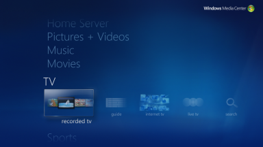 An early view of some of the ideas behind Metro can be seen in the “twist” interface of Windows Media Center. The interface is designed to minimize elements that might interfere with your content…the TV shows, movies, and music that are important to you. Navigational elements such as media transport controls (play, pause, ffwd, etc.) are hidden by default, since many users will be using a remote control to navigate, which will already have dedicated buttons for these actions. In fact, only if you’re running Media Center with a mouse or keyboard will you ever see these elements. This emphasis on content is reflected in the Metro design principle of Content before Chrome.
Likewise, the Media Center interface has a strong emphasis on typography, using text as the primary means of navigation through the available features of the software, and relying on text size to denote hierarchies of information.
Zune and Zune HD
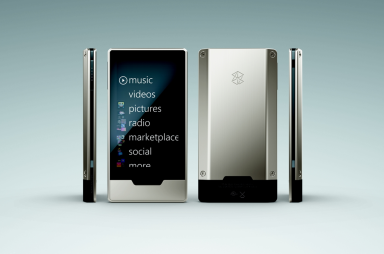 I still remember my first chocolate-brown Zune music player. Don’t laugh, but I loved the “double-shot” translucent finish. The color choices may not have been everyone’s cup of tea, but it’s hard to deny that it was a bold choice to include brown as one of the colors for the first generation of Zune devices.
But even more so was the UX, which took the “twist” interface of Windows Media Center to the next level, making the entire interface all about beautiful and clean typography. And several design choices appeared that have carried on to subsequent implementations of Metro, including text that bleeds off the right side of the screen, indicating the ability to scroll for more, and social sharing (the ancestor of the Share contracts in Windows 8).
The Zune HD stepped up the design, adding a bold, beautiful hardware design that was widely lauded, a capacitive touch OLED display, and a nice touch of whimsy, including a subtly animated home screen that responded to movement of the device by moving the foreground text and background tiles (or vice-versa) relative to one another. It’s not something that you would necessarily notice immediately, but when you did, it was one of those “wow, that’s cool” moments that delight with the attention to detail (delighting your users by attending to even the smallest details is a great habit to get into).
The addition of touch made for an interaction model that relied much more on direct manipulation, such as swiping left or right to change tracks on an album or playlist, that made the device a pleasure to use (and easy to use without needing to look at the screen).
Zune for Windows
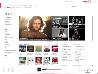 The Zune devices weren’t the only ones playing in the early Metro world. The Zune software for Windows is another great example of the ancestry of Metro, with a major focus on typography defining the UX and hierarchy of information.
Note, also the use of tiles with bold photography overlaid with crisp text. While the UX for the Zune client for Windows is busier than a typical Metro style application should be, in comparison with most Windows apps, there is a dramatic reduction in the use of chrome for hierarchy and navigation. Instead, navigation is achieved by clicking on the applicable content.
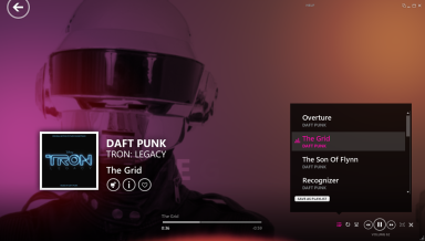 And when playing songs, the Zune client shows off some more attention to detail and early Metro stylings. Again, you see big, bold photographs and color choices, an emphasis on typography, including subtle translucent scrolling text with information about the artist, song, and album currently playing. And you can see the use of the simple and bold icons that continues in the more recent implementations of the Metro design language.
Implementations of Metro
What you should take from these examples are some good practices to follow. When designing Metro style apps, spend some time thinking about the content of those apps. What is the essence of the content? How can I most effectively present the content to the user? More examples can be seen in the following examples of the more recent evolution and implementations of Metro.
Windows Phone
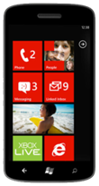 Metro made its first big splash with the introduction of Windows Phone. With a Start screen made up of bright, bold Live Tiles, and an almost entirely chrome-free UX, Windows Phone was a huge change from Microsoft’s previous efforts in the mobile space. And with it, developers can create apps that are not only beautiful in their own right, but also have their own Live Tiles that expose constant, up-to-date information, giving the user a great “glance and go” experience.
Along with a new design language, Windows Phone introduced new controls, including Panorama and Pivot, optimized for the touch-first environment of a smartphone, and designed to make navigating through content simple and intuitive. And the Windows Phone SDK and tools included project templates that provided named resources for all of the variety of font sizes and such, making it easier for developers to follow suggested practices.
XBOX 360
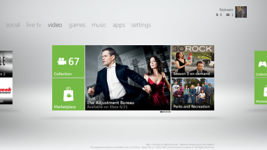 Another recent example of Metro design is the newly-updated XBOX 360 dashboard.
Notice that the implementation of Metro on the XBOX 360 is not identical to that of the phone. This is natural, because there are critical differences in how users interact with a game console and TV compared to how they interact with a phone. The XBOX 360 dashboard is optimized for use with a game controller, Kinect, or voice, while the phone is optimized for touch.
The XBOX 360 also includes a music and video player based on the playback experience in the Zune client for Windows, and if you have not used it, I highly recommend it, both as a beautiful player for music (particularly if you have a Zune Pass), and as an example of a bold and effective UX design.
Despite the differences between the Windows Phone and XBOX implementations, the essence of the Metro design language is there. Unnecessary decorative chrome has been stripped away, leaving the important information and content to take precedence. While most of us won’t be developing for the XBOX 360, the use of the Metro design language here helps familiarize users with Metro, discover content more easily, and prepares them for using Metro on other platforms.
Windows 8
Of course, I can’t talk about the Metro design language without discussing it’s most mature and sophisticated implementation, Windows 8.
 Right from the moment you turn on a Windows 8 device, the emphasis on design shines through. Beautiful photography, and important information at your fingertips, without even needing to log in (of course, the user is in control of which apps can display information on the lock screen). The use of typography and of visual white space allows both the beauty of the lock screen background and the user’s information to co-exist in harmony, neither detracting from the other.
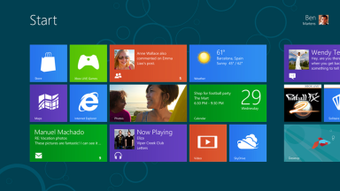 And upon logging in, the user is greeted by the new Windows 8 Start screen, with Live Tiles providing access to the apps that matter most to them. These Live Tiles are alive with activity, updating the user with relevant information on upcoming appointments, recent emails, and more, giving them easy access to the information that is most important to them, without needing to open the apps. Of course, Live Tiles can also be used by developers to entice users to return to their apps for more information on the tile updates, so a great tile design is an important step towards a successful Windows 8 Metro style app.
As developers and designers, we should think of Live Tiles as the front door to our application, and put some effort into making that door as enticing as possible, to bring our users in again and again. The MSDN Library provides guidance on the use of tiles that you should review when designing the tile for your app.
How Metro Helps
So far, I’ve mostly talked about Microsoft’s implementations of the Metro design language. But how does Metro help you, as a developer, become better at design?
The Grid
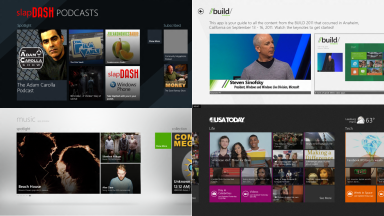 No, I’m not going to start noodling on Tron: Legacy…I’m talking about the grid as a guide for laying out the UI of your Metro style application. The grid allows us to create Metro style apps that are consistent, both visually and functionally, with other similar Metro style apps. Note that this doesn’t mean that you cannot differentiate your app visually. All of the apps (keeping in mind that these are from the Consumer Preview release, so they are previews, and should not necessarily be considered reference applications) shown at left leverage the grid to consistently lay out their content with a header and consistent white space that not only gives the content room to breathe, but also automatically leads the users’ eye to the right location to find the important content. And each app is visually distinct, with variations in the balance between images and text, sizes of UI elements, use of color, etc.
Now if you’re developing a Metro style game for Windows 8, of course you probably will not use the grid to lay out your content, but for most Metro style apps, the grid will provide a very useful way to easily make your app “fit in” with the Windows 8 environment.
My co-worker Chris Bernard, who is a UX Evangelist (yes, that’s his actual title) puts it this way:
A grid helps you remove random and arbitrary choices around placement that can harm user experience—but it also provides flexibility and you should ‘respect’ the grid versus ‘obey’ it. Pushing boundaries on purpose versus by accident.
That focus on seeing the grid as a tool and a starting point, rather than a rigid requirement, is exactly right in my view. The grid isn’t there to limit you, but to free you.
Templates
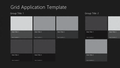 Templates will not turn a developer into a designer. But what templates can do is to give you a solid head start towards following best practices in the design of your application. The templates included in the Visual Studio 11 beta release include a Grid application template and a Split application template (there’s also a Blank application template for folks who want to start essentially from scratch), as well as Fixed Layout and Navigation applications. The Grid, Split, and Navigation application templates all include styles (CSS3 or XAML resources) that help align your content to the grid.
The Grid and Split application templates both also include sample data that demonstrates the databinding features of both HTML/JavaScript and XAML-based Metro style apps. And these templates also dovetail with the templates for the Search and Share contracts, leveraging the sample data to demonstrate how to implement these important features.
 Whether you choose to leverage one of these templates for your final application or not, I highly recommend that you go through the exercise of building at least a simple application based on the templates as a learning exercise. It will help you to see and understand how the various parts of a Metro style application work, both visually and functionally.
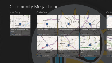
And with a little bit of work to retrieve some custom data in place of the sample data, perhaps a bit of added background interest via colors, an image, or even SVG elements, a few calls out to REST services, and you can end up with something a little more interesting, such as my in-progress Community Megaphone Metro style app shown at left. Note that, thanks to the the use of CSS Grid for layout in the Grid application template, my title, headers, and content all align to the recommended positions, with little or no additional work needed on my part, so I can focus on the aspects of my application that are differentiated, such as the SVG logo I’ve used for the background, and the Bing maps I’ve used for the individual tiles representing each event.
It’s important, too, to note that the templates provided in Visual Studio 11 beta are but a couple of examples of how you can implement applications that embrace Metro style principles. You should explore using variations of size and proportion in your apps, and see how that impacts the visual hierarchy, or whether such variations may help highlight featured and/or relevant content.
Guidance
Last, but certainly not least, developers wanting to learn more about Metro style app design, and the Metro design language can find guidance at http://dev.windows.com (focused on developing apps for Windows, and includes a section on Metro style apps for developers) and http://design.windows.com, the latter of which is focused primarily on designing UX for Metro style apps in Windows 8, and (at the time of this writing) contains the following resources:
- UX Design Patterns
- Design Principles
- Downloadable Design Assets, including .psd wireframes
- Case Studies
-
End-to-end App Guidance
- and more…
Conclusion
It’s a great time to be a developer, and whether you’re developing Metro style applications on Windows 8, Windows Phone apps, or even web sites, design is becoming an ever more important part of the job. Taking the time to add design skills to your toolset will help you (and your apps) stand out in a more and more crowded marketplace.
My thanks to my Microsoft colleagues Chris Bernard and Sara Summers, both of whom have far more design expertise than I can lay claim to, for reviewing this post prior to publication. Their input helped me refine some of the ideas above. Any remaining typos, strange ideas, or odd statements are purely my own.
[Note: subsequent to publishing, I decided to update one of the photos to reflect the most current release of Windows 8 at the time of this writing.]
-
- Case Studies
- Downloadable Design Assets, including .psd wireframes
- Design Principles
Comments
Comment by Chris Gomez on 2012-05-17 13:36:00 +0000
Let me start by saying… this is a must read post for everyone new to the concepts of how the Metro design language has made it’s way onto the phone and Windows 8 and how it benefits users and developers.
But…
The Xbox “Metro” UI stands in stark contrast. On the other platforms or applications, the user is in control. Text (instead of chrome) leads directly to content. Tiles lead directly to content or convey important personal information (especially on Win8 and Windows Phone).
On Xbox, “Metro” (I can’t bring myself to call it an example of Metro), is just that they both decided to use tiles and something similar to the twist interface. Content is what’s missing. On the NXE dashboard, going to friends meant I got to see (or scroll thru) all my friends. I could invite them to a party RIGHT THERE. Now, I get to see three, and there’s more clicking to go to get to the friends I want to invite to a party, and even that is more clicks away.
The Quickplay tile was a GREAT idea, but it’s alone is a vastness of ads… screen where the most valuable real estate, the center huge tile, is an ad. Why isn’t it my most played game that I could easily use a controller or my hand to activate? That big space is fantastic for the 10 ft experience or the Kinect experience.
I’ve gone over many tasks I used to perform on my Xbox in NXE (“New Xbox Experience”, or the previous dashboard) or the original blades. And most of them are faster or easier by hitting the guide button (and bringing up the “mini-blades” menus) OR using Bing. Now, Bing is AWESOME on the Xbox and “Xbox, Bing, Trials Evolution” beats going to games > titles > xbla titles > recent titles > T > Trials Evolution to play my game, but why is that so hard with the controller? It’s easier to use the mini-blades in the guide button.
This is not your fault, and you are not to be scolded for writing this article, but if someone is reading this and ONLY has an Xbox 360 (they don’t have a Windows Phone, Zune, Media Center, nor Windows 8 previews), I would NOT want them to judge the Metro book by that cover. That is not the Metro design language putting it’s best foot forward and you shouldn’t feel discouraged if you are unhappy with the switch from NXE to the current Xbox dashboard.
Comment by devhammer on 2012-05-17 14:03:00 +0000
Chris…appreciate the feedback. I’m also a big fan of Bing on XBOX. And the Quickplay tile is perfect for my wife and kids, so they don’t have to wade through menus, etc. just to play the next TinTin episode.
As for the items you’re not fond of, I’d encourage you (if you haven’t already) to share your feedback here: http://www.xbox.com/en-US/forums.
Comment by Anonymus Coder on 2012-05-18 06:34:00 +0000
I am also a developer, and i am impressed with the Metro look. But I feel as if i am the only one in this world that has to develop data centric applications which are not full of images and graphs.
I miss an example application of something more that just a music player or a news-feed reader…. something like an invoiceing application – preferably one that would show some very nice way of showing some data inside the tiles on the desktop in windows and 8
Comment by pg on 2012-05-18 08:27:00 +0000
Well, fine. I’m sure the Zune interface looks great. But I just cannot fathom out where anything is. Unusable.
Comment by Timothy on 2012-05-18 08:55:00 +0000
All the “in defense of Metro” blog posts extoll the virtues of the Metro design philosophy… without ever mentioning the fact that most people just don’t like it all that much. It does work pretty really well on XBox. But Zune and Windows Phone 7 were/are complete market failures. Windows 8 boards are absolutely stuffed full of posts along the lines of “how do I get my classic start menu back” and “how do I turn off Metro.”
Metro has some really good ideas embedded in it. High contrast icons? GOOD. Less useless chrome? GOOD. Simplified layout? GOOD. But then MS just went to the absolute extreme they possibly could and ruined it. A good example are the Windows Phone 7 and Windows 8 live tiles. They are huge and dominate the screen. But is that really what you want for your primary launcher? It’s basically a widget board and offers useful information, but I don’t want to have to press Start to see that crap. When I press Start, I want a simple, easy to navigate, easy to search list. Yes, you can do that from the Metro start screen, but it’s not the primary focus. If it was, the applications would not be organized in a flat list.
Comment by devhammer on 2012-05-18 09:09:00 +0000
AC – we’re still pretty early in the game, but I think yours is good feedback, and as I and others on my team are working on demos and samples, it’s something we’ll definitely look to address. What kind of data do you think would be relevant for tile notifications in an invoicing application? For example, is your desire for a sample application that is used to submit invoices, or one that’s used for invoice processing and approval? In the latter case, I can totally see using tile updates to notify the user that there are new invoices to review and approve.
I definitely want to emphasize that the sample apps that have been shown so far aren’t necessarily the end-all-be-all of what’s possible with a Metro style app. There’s tons of room for imaginatively presenting information, and I think some of the best practices will likely be hashed out by real folks getting creative and showing what’s possible.
Comment by WiredTexan on 2012-05-18 09:33:00 +0000
Good read. I’m a fan of Metro and certainly loved my Zune HD. As a dev I love WinPhone and believe WinRT is the best thing to come out of MS since .Net. However, because of the lack of market share I jumped on the iOS band wagon. 😉 Oh boy do I miss the tooling from MS and the MS ecosystem. Thank goodness for AppCode.
Anyway, I was talking to our designers. Honest to goodness artists and UX experts that design UI’s for iOS and Android. (We’ll do WinPhone and WinRT if we ever get asked.) First, they thought Metro was good, they loved the XAML based tooling, for iOS and Android they create art assets so the idea of generating the XAML directly was well received by designers, architects and devs. However, they felt, as a UI, it had no legs, they all agreed it was too limiting and didn’t think it would last.
I pointed out MS has always put a premium on consistency, to the point that the OS and apps for the OS were down-right ‘ugly’ until Vista. But they weren’t convinced. They liked the freedom iOS and Android gives them.
I find it such an odd situation, with XAML and tools like Blend its relatively easy to create beautiful applications, while in iOS we either use assets, (huge bloat), or we are reduced to hand coding the graphics. But Windows apps go for the utility look while iOS apps are about making beautiful apps.
And I agree with the sentiment posted by someone else, show some real world data-centric apps! Most of the apps I develop now are for businesses, not twitter clones. It would be nice to see some good examples of well designed applications that present data to users in meaningful ways.
Guess I should give an example: Lets say a huge insurance company wants to create a mobile application that provides the user with access to all their health-care insurance information. Fortunately, its going to be read-only because of regulations. Unfortunately we need to jump through hoops to get the information is a safe and secured manner and keep it secured because of the same regulations. The user will have access to benefits information, provider information (given gps or a zip) on a map, detail information on claims and payments. This is just a sampling of the information that would be in such an application.
The challenge is, there is a lot of ‘drilling’ down into details. Another challenge is that once I reach certain information I need to be able to navigate to other information in a non-linear fashion. IOW many business applications do not or cannot support linear navigation.
Another complication, especially for insurance, dependents can’t see the same information as the primary! IOW lots of complex business rules for what can or cannot be displayed on individual screens or scenes.
Comment by Guest on 2012-05-18 09:34:00 +0000
The Windows media center interface was the worst ever and completely useless, just like Metro will be for desktops. It may be a great operating system for phones and tablets but its just a tad late to the game for those devices, MS should have released a better operating system for them years ago, but since they didn’t all Windows users are going to have Metro forced down their throat whether they like it or not… I’m betting they won’t like it and the flow of business users to Mac and Linux will only increase after Win 8.
Comment by Discit on 2012-05-18 09:48:00 +0000
Metro seems poorly designed itself with a noxious aversion to user feedback, so why would one let Metro dictate good design?
People firmly rejected Metro on Windows Phone 7 and it seems like MS response is to solder it to Win7 to force it on the desktop to finally get people comfortable with it.
It’s like MS is in denial telling us we just don’t know good design but good design is what works well and is intuitive, and Metro seems a step back.
Then they say everything is moving to touch, but touch has its place.
I could probably learn something from Metro, but until it seems like MS is listening to what people want and not just using their monopoly to push their mobile OS I wouldn’t let Megro dictate design.
Comment by Info on 2012-05-18 11:30:00 +0000
One key difference between the use of wayfinding signage and metro that MS seems to have forgotten about, is that it only works where those signs are generally sparse in number, and so you can quickly identify them against their surrounding.
Look at your image above, just a few signs across a large area. That’s fine. Now go to an airport concourse junction that has twenty of these arranged on a pole – and the recognition aspect dies as you have to scan through them all again.It will be the same with this UI – whilst we’re at consumer previews with a few dozen apps available – yeah, fine. But when/if it takes off? Just that initial tile screen on Windows 8 – with the monochromatic tiles and silhouettes, just how are the (if there will really be) hundreds or thousands of app developers going to differentiate their offerings from the rest?Have you seen the feedback that has greeted the second beta of VS2011? Now that team listened to the feedback from beta 1 and got rid of the metro UI – that that has been the single biggest step forward – it was unusable for such a complex environment as Visual Studio with so many similar options, as limited color palate made the buttons all look the same. The same thing will be true when people try to create real business – not consumer – applications using this. Or is the MS really saying we’ve had enough of trying to play in the business world and only want to target home users and consumers?
Comment by Robert J. Good on 2012-05-18 11:42:00 +0000
Metro is fantastic for a “consumer” interface…where pushing quick tidbits of information is useful. I have migrated my web design to a more metro-like interface. It is standardized and I dont have to spend days/weeks arguing over layout.
For “producer” interface, I am so glad that Win 8 keeps the traditional desktop experience alive and well. Metro isnt targetted for people who produce.
And icons are so 1985…I am so thankful for Metro killing the horribly outdated icon screen design.I cant stand looking at an iPhone anymore, after switching to windows phone.
Comment by Kitty on 2012-05-18 12:18:00 +0000
As much as I agree, I still shudder at the thought of grid layout, being an asp.net 1.0 victim.
Comment by Lderan on 2012-05-18 12:33:00 +0000
I am apart of the people and I do not reject Metro, in fact I quite like it. So much so I bought a HD7 on launch day and never thought of returning it.
Think it has won numerous design awards as well. So there must be something there that is of merit.
Comment by Murray on 2012-05-18 12:53:00 +0000
I must say I’m with AC on this.
I’m a developer with more than 25 years of coding for unglamorous line-of-business apps, chiefly accounting and Payroll.
These tasks are down-and-dirty data entry chores that require rapid data entry. Mousing is an anathama to speed and “pretty” doesn’t increase productivity.
I want to but, try as I may, I cannot find any benefit to be derived from Win 8 and Metro-style for LOB applications.
So, I’ll make a pretty tile and hope the rest of the code runs.
Comment by Master Chief on 2012-05-18 13:38:00 +0000
For me metro is the way forward. I can’t say, if it would work in mouse dominant keyboard, but on a touch interface, it’s the way to go.
At first when I opened my Lumia I thought to be greeted by a beautiful wallpapered welcome screen, and was taken aback to see all the tiles. But the more I used, more useful it got to me. It’s like when I had my first PC I used to install theme and widgets, to make the screen look as pretty as it can be, but that would eventually lead to a cluttered desktop, and then I would revert back to the original, no themes. Metro doesn’t take much in pretty design, but it gets the job done, spot on, looks simple, which was it’s primary idea and doesn’t distract. If the interface makes you to just peep at the start screen and the get away from boring start screen, then it actually has done it’s job, putting your information first, then itself.
As for people who just thinks that such interface can’t work, yes there would be some for whom interface would not work, but there are many who haven’t used it before giving opinion. Windows 7 still gives classic icons in control panel because they just want what they are used to. My father still uses classic screen on vista, because he thinks the primary start screen is not good, but it is actually some what unfamiliar to him. I don’t wanna be a bad son, but I admit must that if he had used the start with search he would love it, but he doesn’t. Just give it a try and you love the uncluttered and fast interface. I mean now I don’t like the androids bog screen with small icons and so much left space for us to fill it with useless widgets, and the slowing the fun. Just the author said, if interface has won so many awards, then it must be good. Please don’t just judge a book by it’s cover.
Comment by Discit on 2012-05-18 16:06:00 +0000
Some people might like it. I was not talking about everyone in the world, just the vast majority of mobile phone users and developers.
There’s also something to why so many people had so many issues with Windows 7 phone.
Comment by Ilija Injac on 2012-05-18 19:50:00 +0000
I agree 100%. Developers today should mutate to something like “Devsigners”. Most of the developers already like good design and know what makes a good design – not only on the screen. I think the time has come – especially with Windows 8 to really, really update your design-skillz.
Comment by Johnathan on 2012-05-18 20:11:00 +0000
The thing I find hardest as I am learning programming when it comes to UI design:
When putting a UI together I find myself getting stumped when trying to find a good balance between the way I think the UI would be the easiest understood and trying to also keep the UI familiar.